
Always be Kind.
I was given the opportunity to develop all of the branding and visuals for a new children’s education charity, meant to honor the loss of a young elementary school teacher, lost too soon.
Based around her philosophy of teaching and expressing kindness and empathy, I aimed to create a visual language that was soft and mildly feminine yet accessible. The only indicial guide line was in incorporate her favorite color, purple.
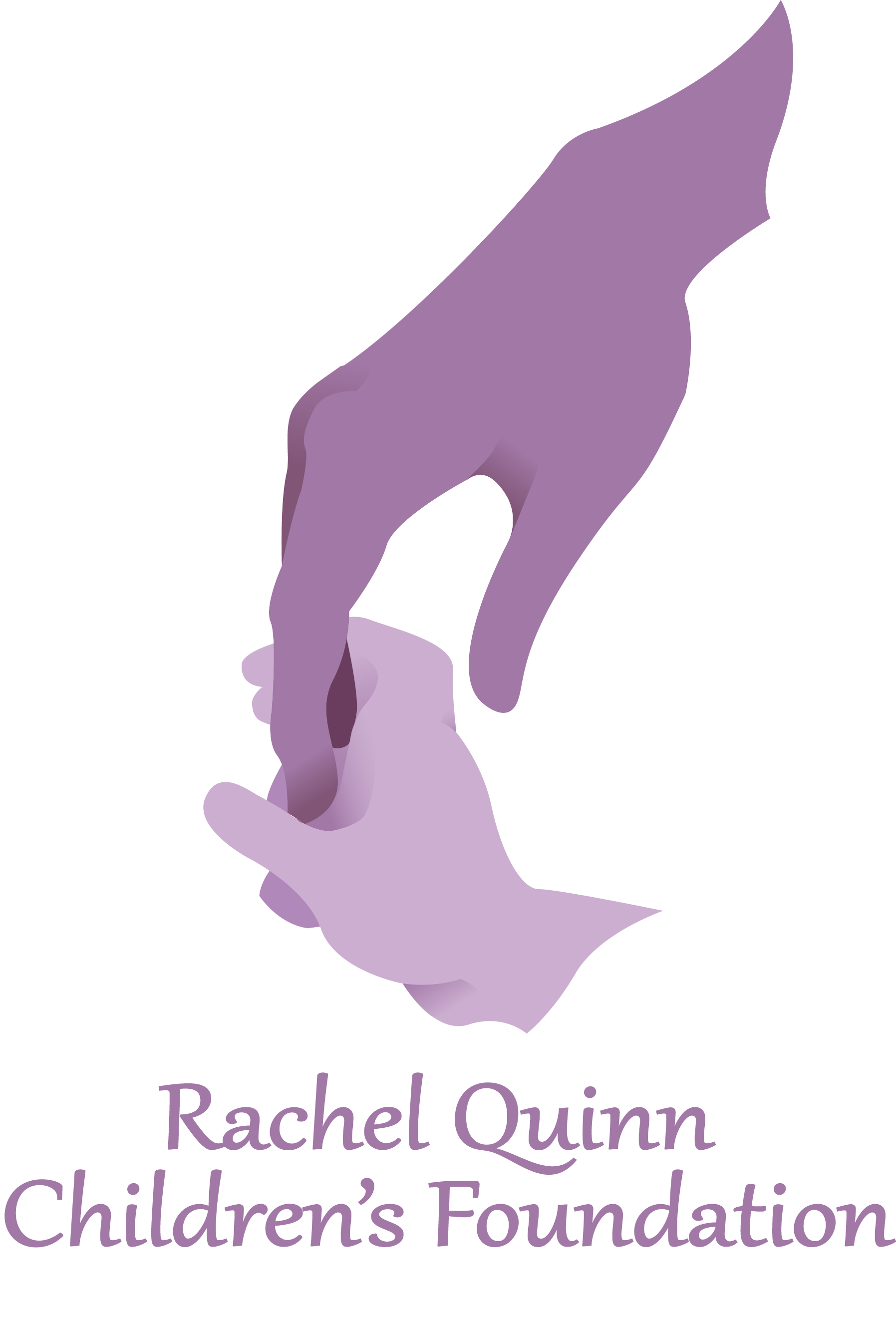
The finished logo for RQCF featured a rendering of Rachel Quinn's hand reaching down to hold that of a young child. It was important to feature the name sake of the charity in the logo while displaying what the organization does, support children.
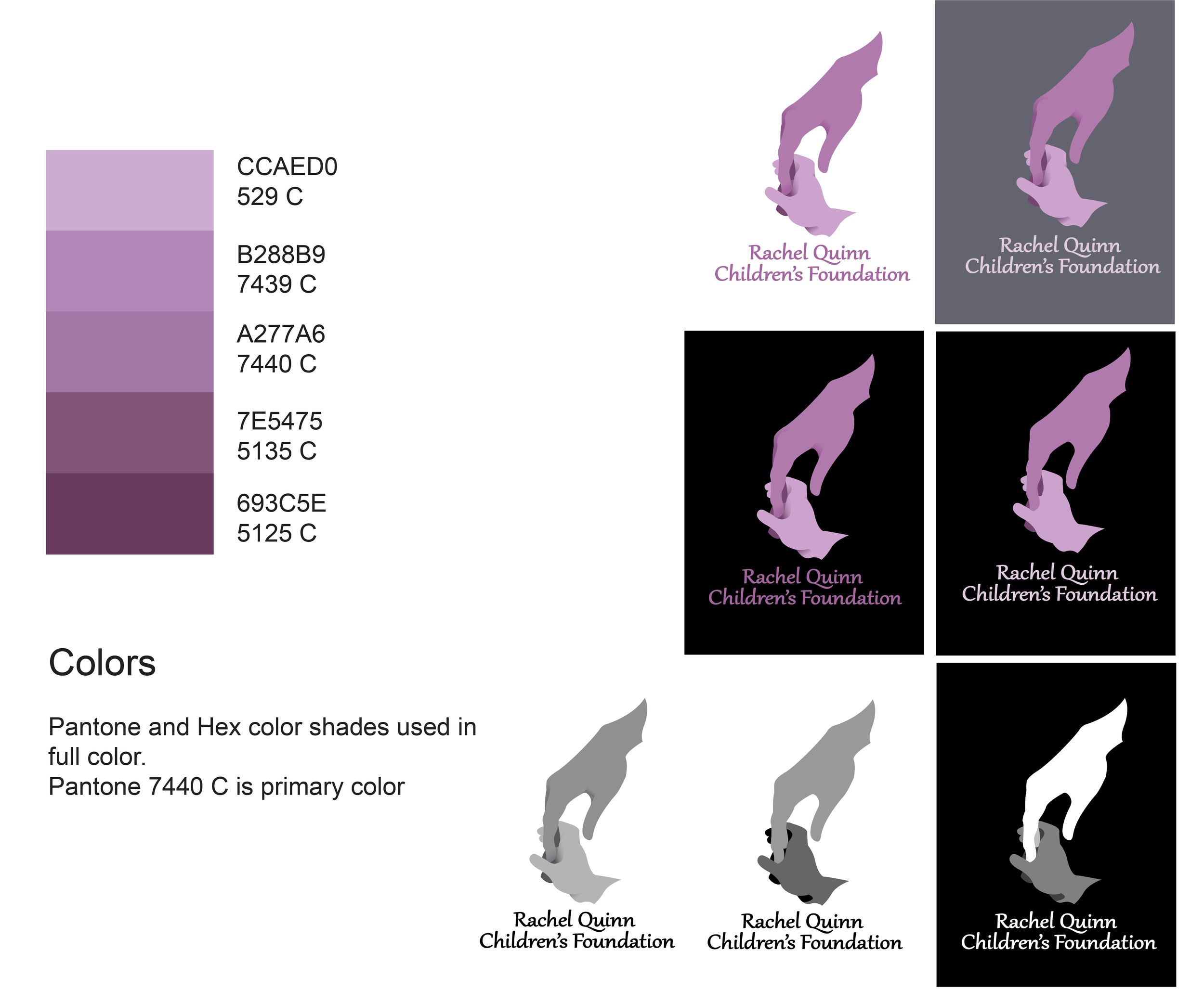
Logo spread sheet. Features the signature colors of the organization and different ways of displaying the logo with different backgrounds.
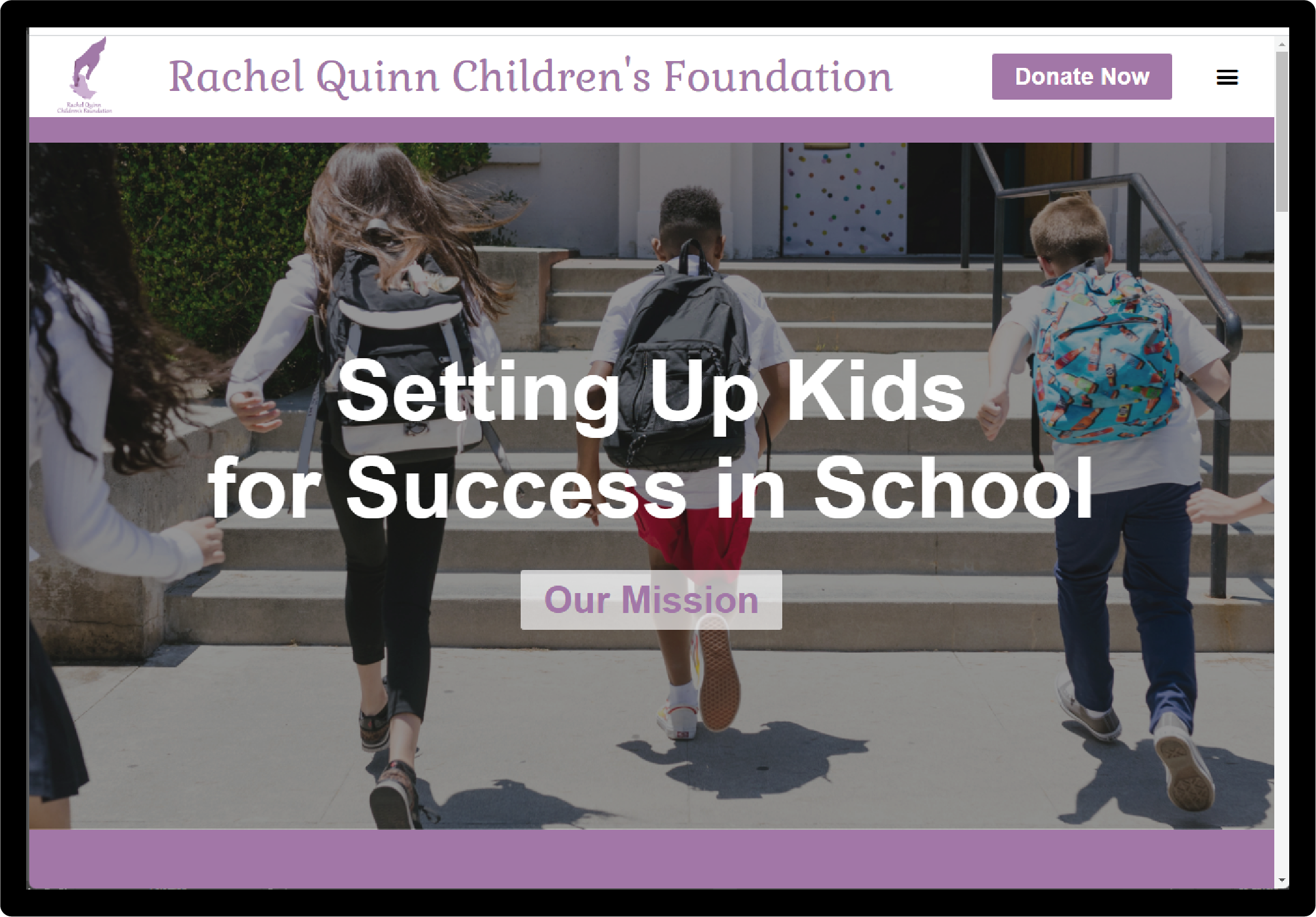
The website for RQCF features logos and signature colors for continuity. Text is large and clear for consistent legibility. Clean simple design and ease of use was the most important part to this design.
Close up on minor logo images featured on the website and Instagram page.
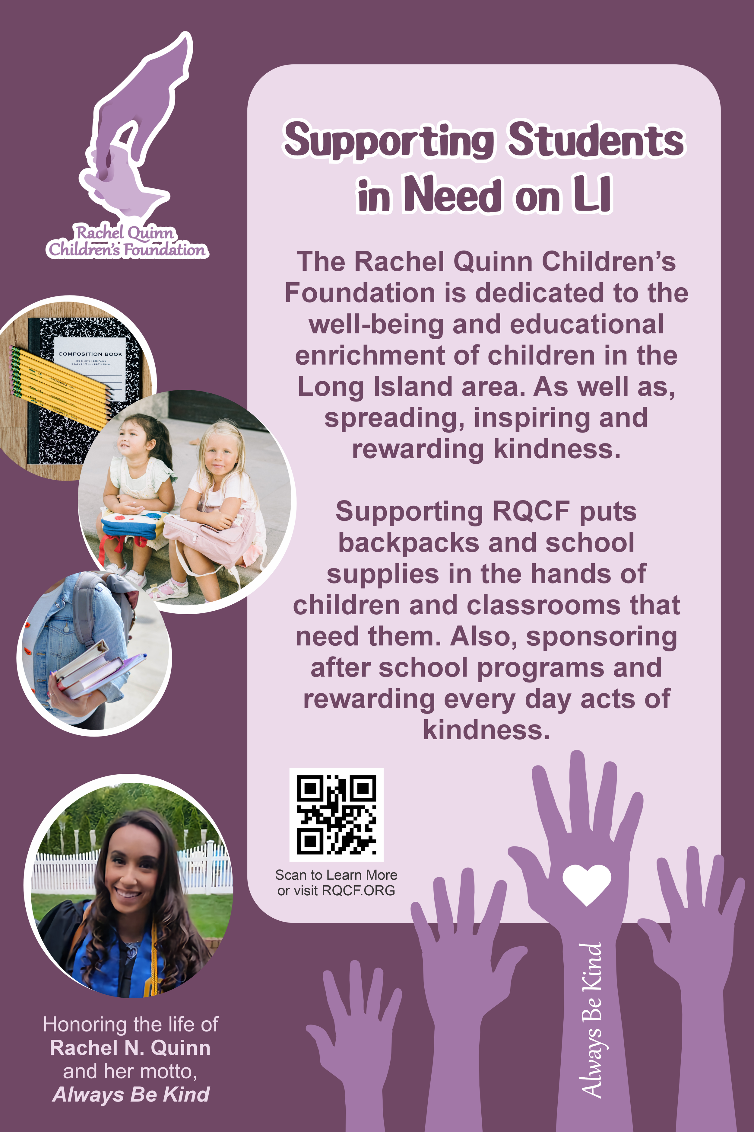
Table top poster featuring highlights of the foundation. Made for events to spread awareness of the organization.
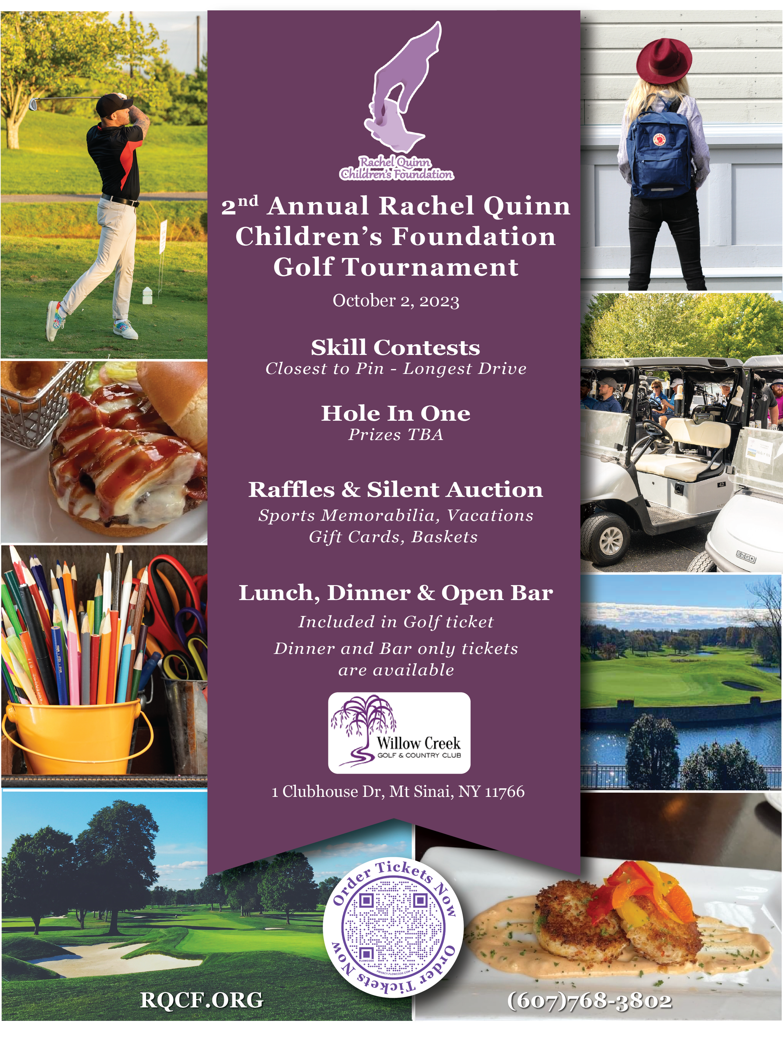
Event flyer for annual golf outing
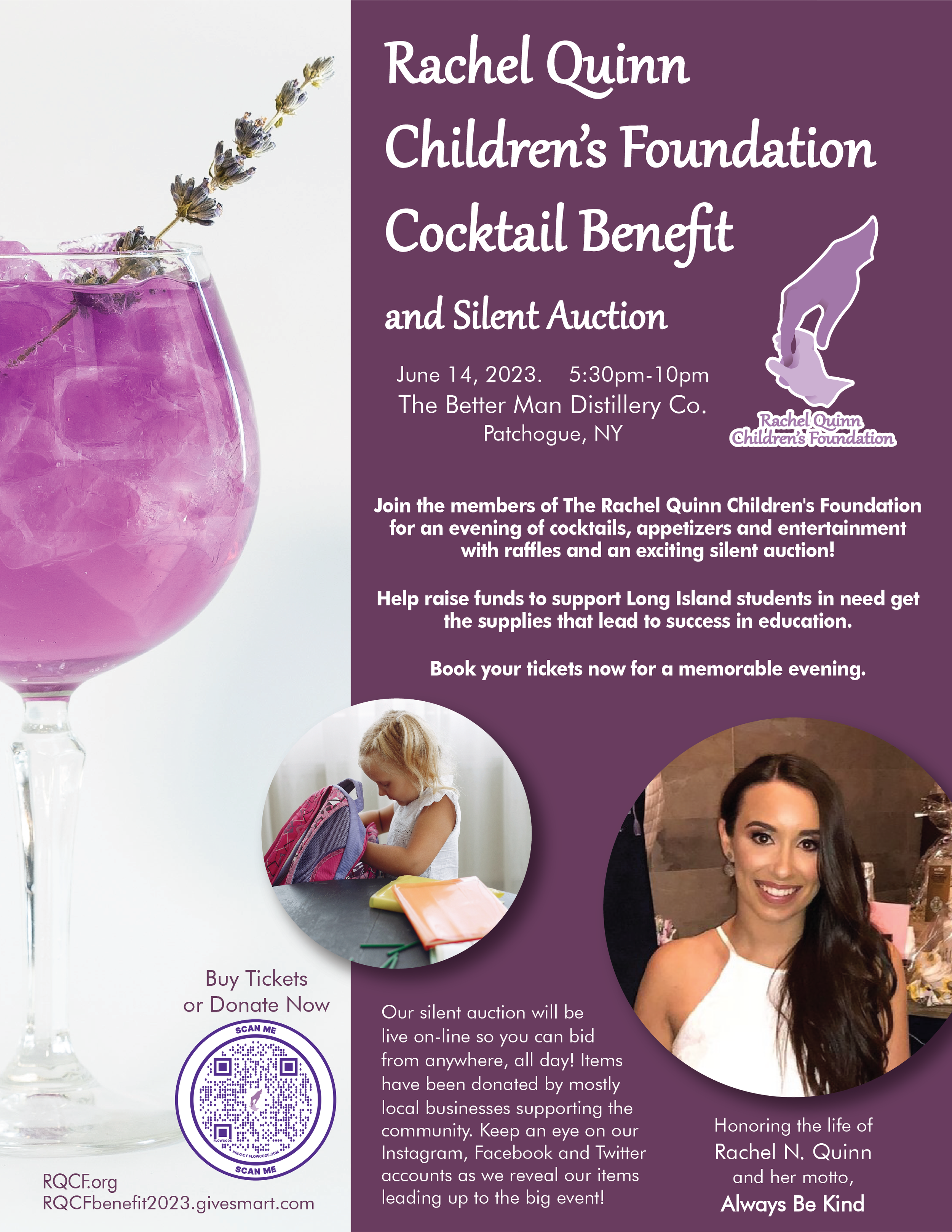
Event flyer for annual cocktail benefit
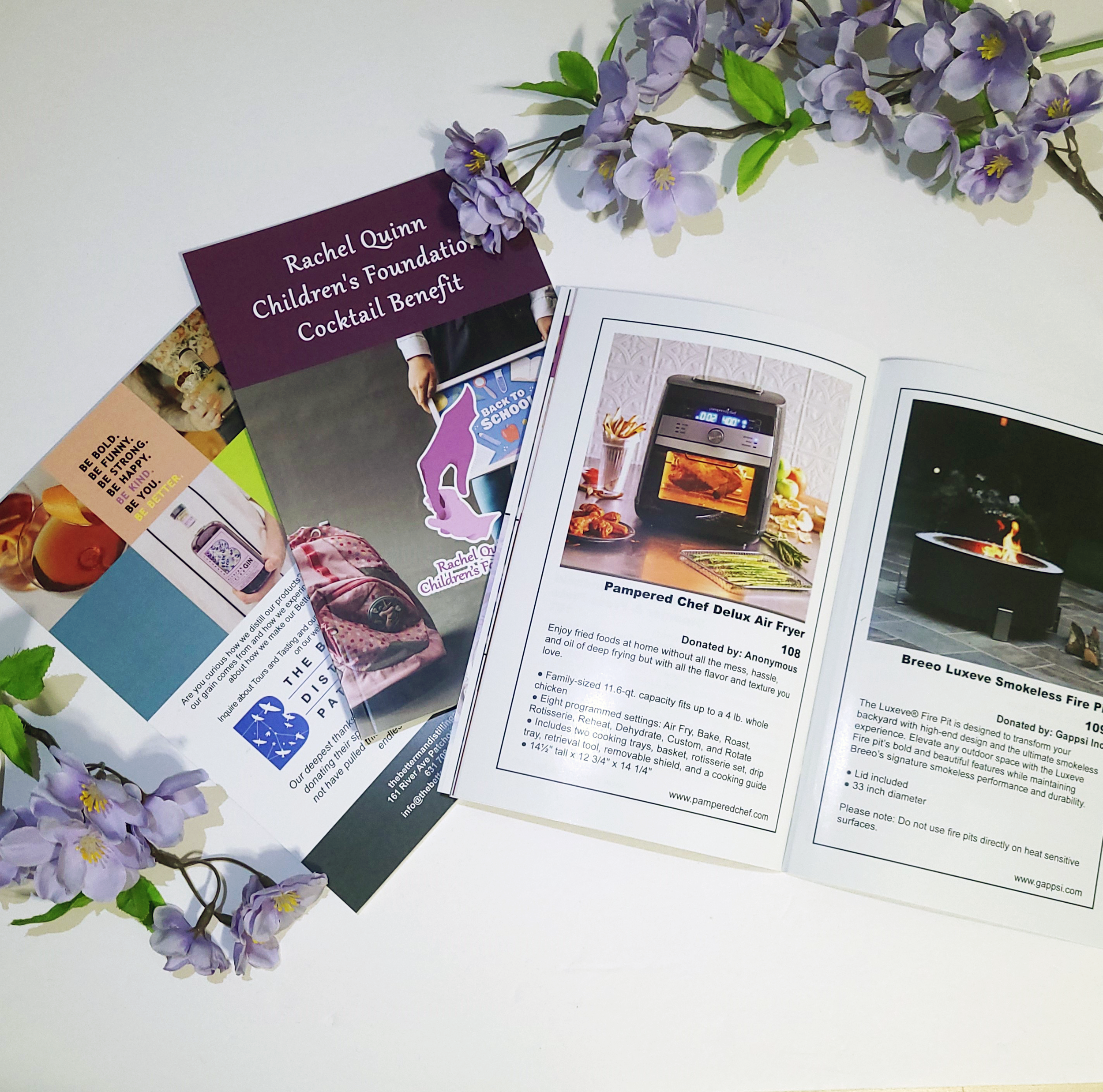
Event catalogue. Featuring highlights on all silent auction items, charity information and advertising for sponsors. Designed after traditional playbills, with a clean design that is easy to flip through quickly
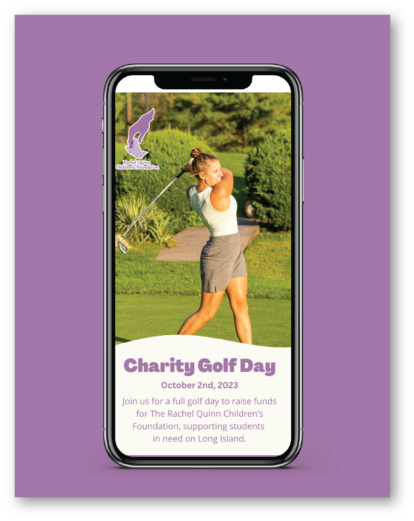
Event pages to sell tickets for fundraisers.
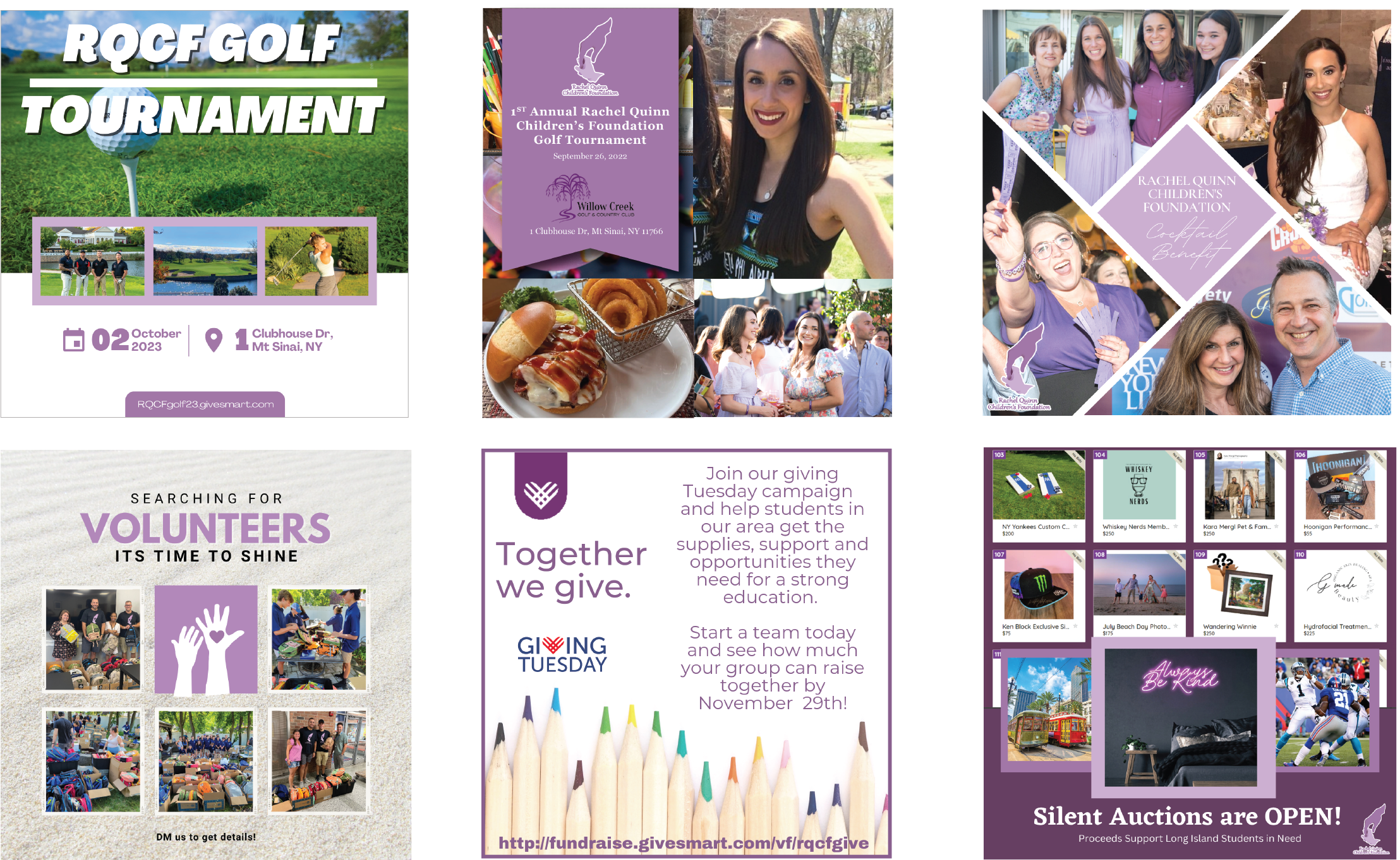
Examples of social media posts. Sticking to color branding and defining a bright, fun, professional personality for the organization.