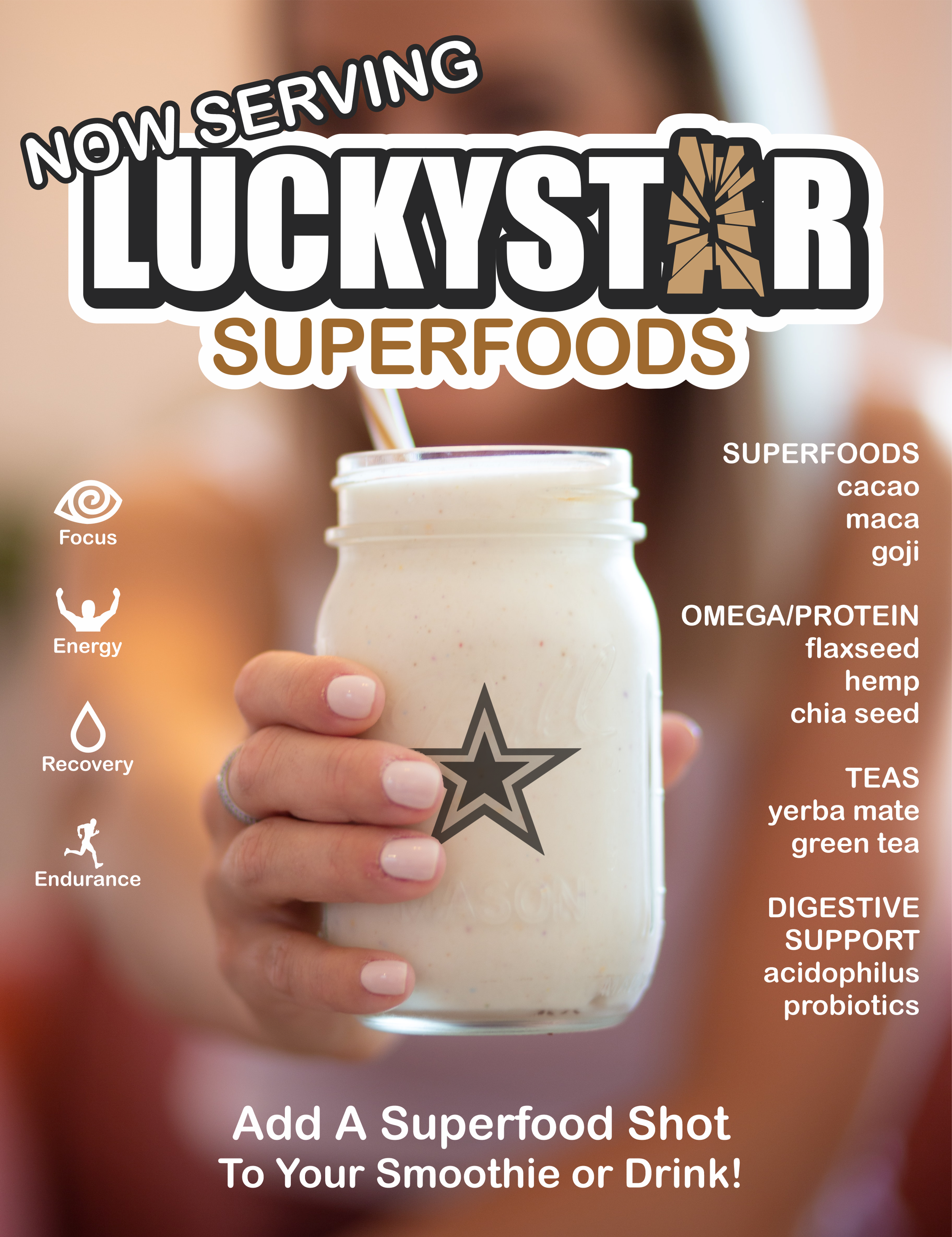
Focus. Energy. Recovery. Endurance.
I was asked to create the logo and package design for a new trendy brand of superfood mix. The client was interested in an energetic design that would appeal to gamers and casual athletes.
Chosen logo design. A bold high contrast font was chosen for most of the brand name. I included a break out letter that had a shattered and jagged quality. Since the brand name did not clearly express the product we opted for a subheading in a more classic font.
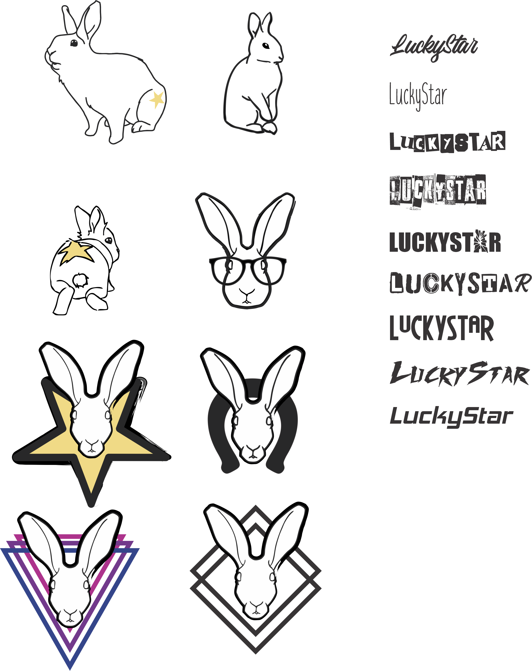
Early logo samples. As we explored what the client wanted for their branding and marketing. They considered a 'lucky' mascot that might be trendy to teens and 20 somethings. I tried to consider how the images might work on stickers and video streams and looked for designs someone would want to have around aside from its relation to the product in an effort to increase the visibility of the brand with less effort and cost.
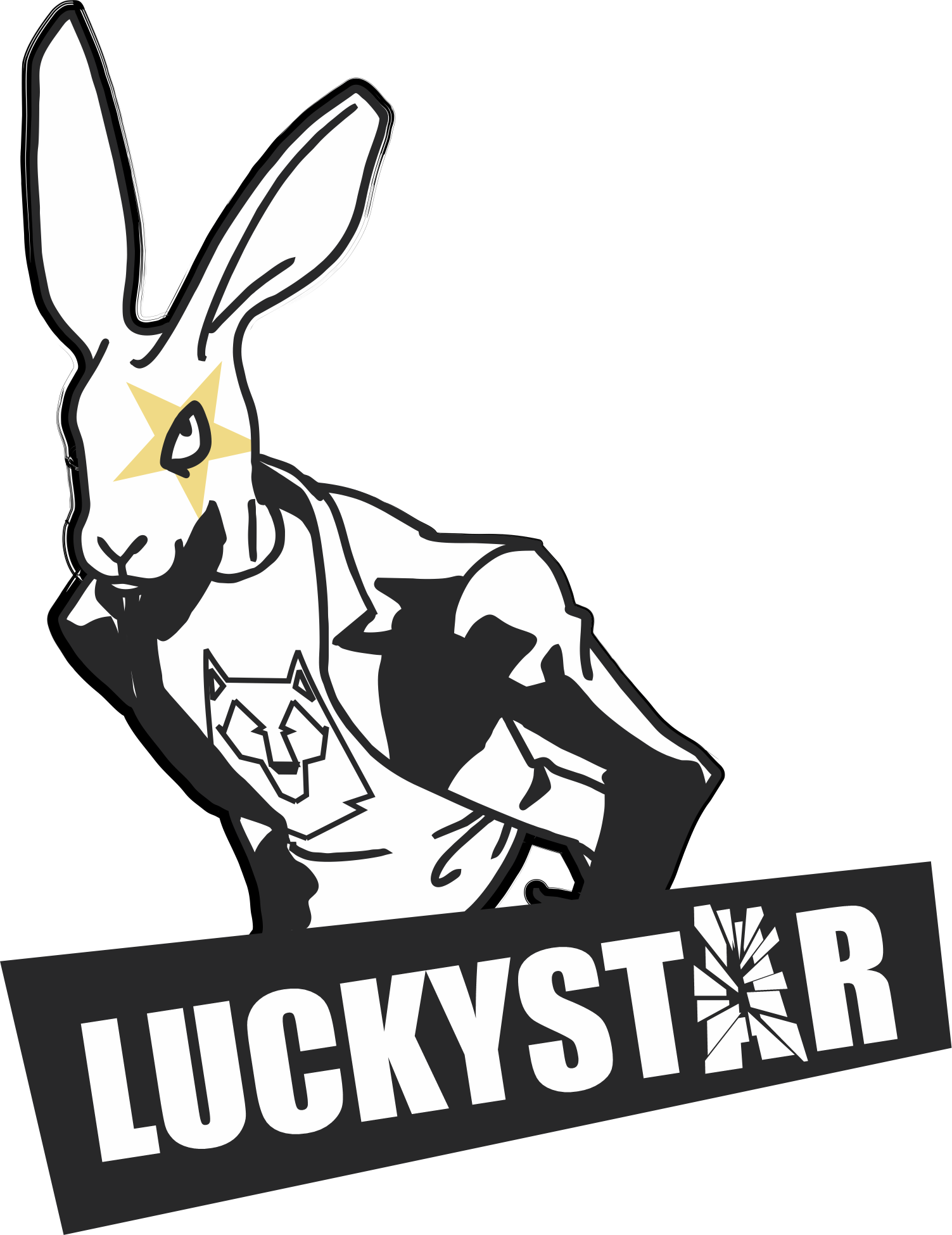
First pass at logo. Following the lucky rabbit theme, I created a character to match requests of the client. They liked the drama of it, yet found it more antagonistic than they wanted their brand to be.
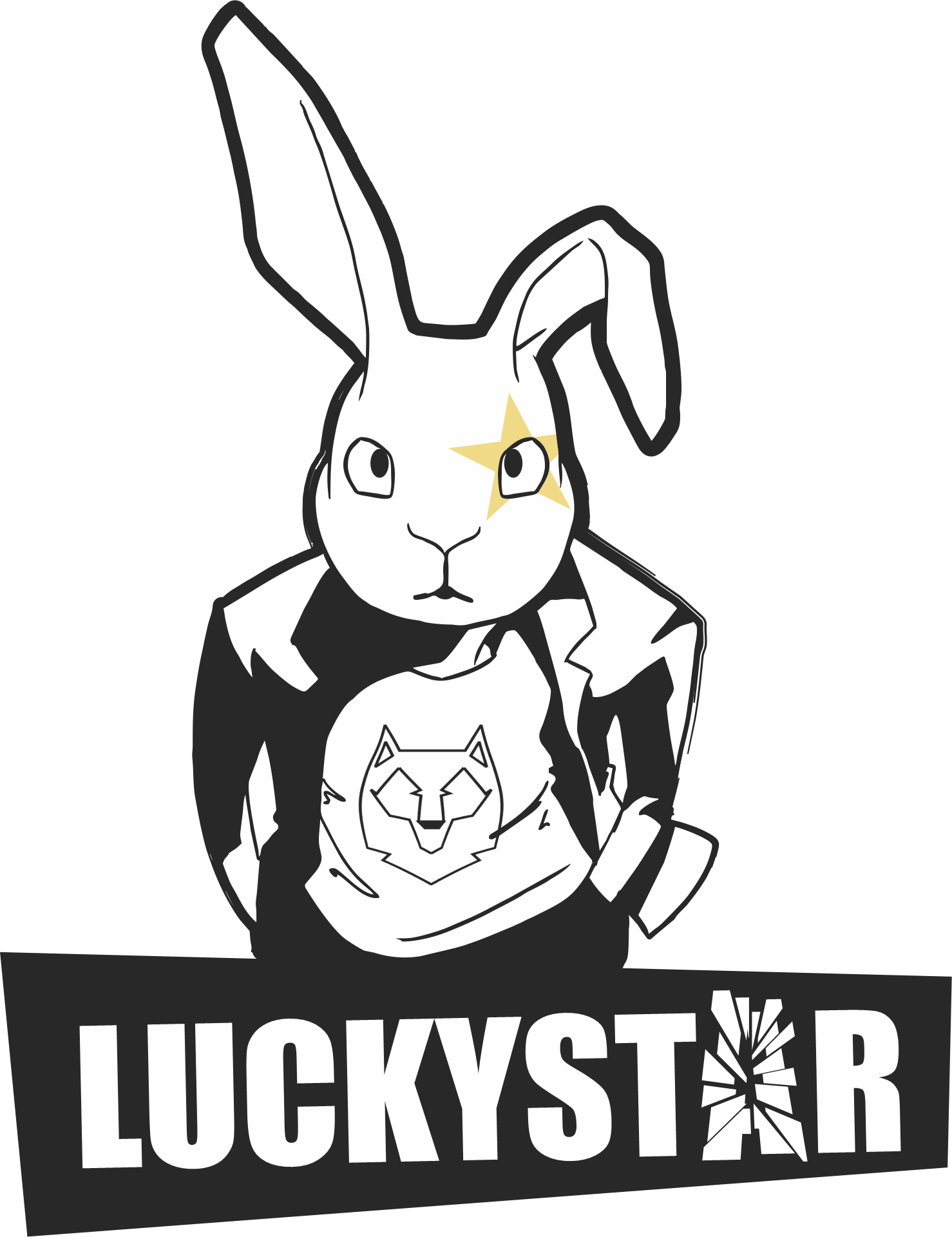
Logo second pass. Instead of a lucky rabbit character I pivoted to a lucky bunny. This softened the imagery to be more in like with the company values. We eventually chose to simplify to text only when the marketing strategy changed.
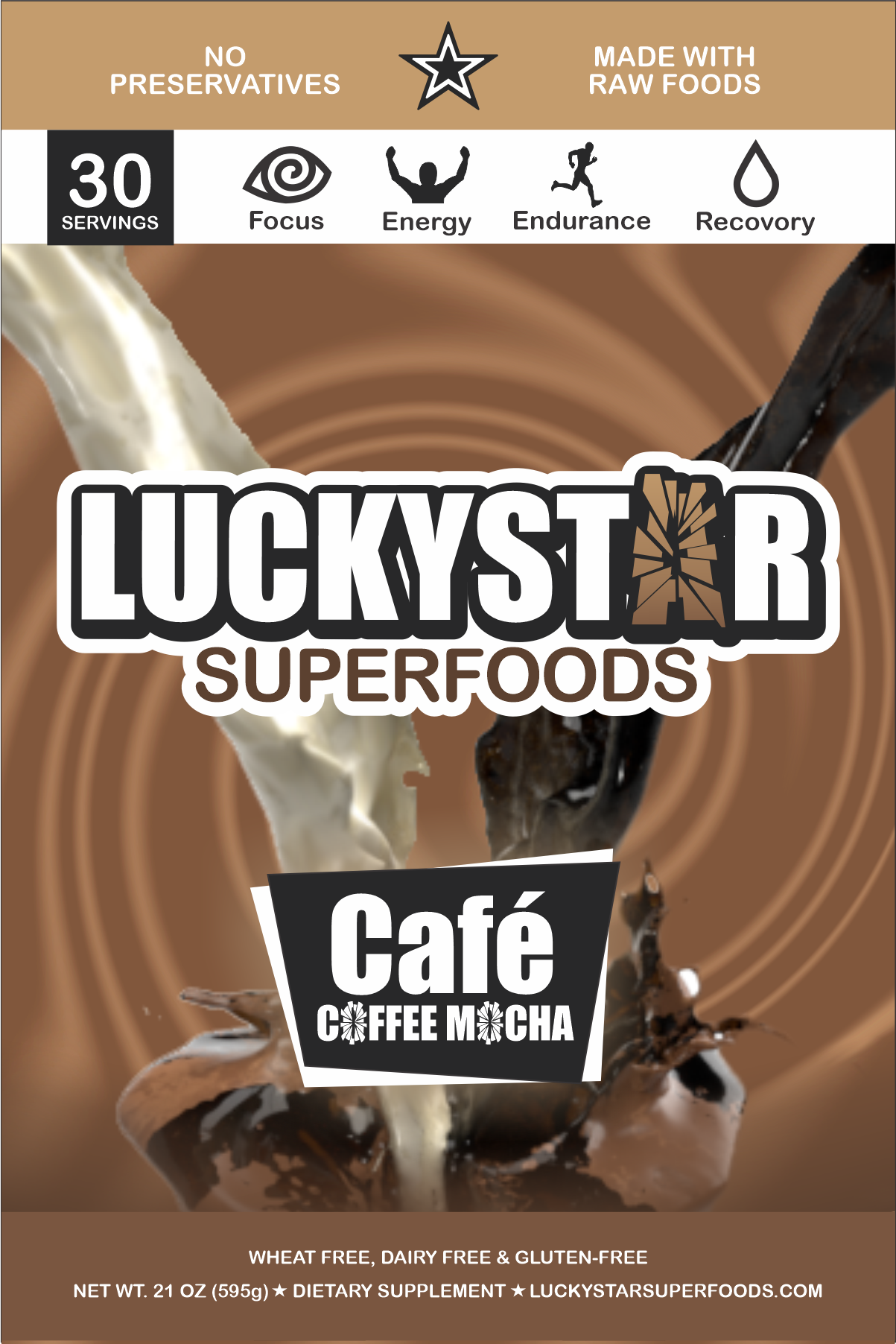
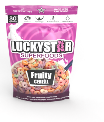
Front product label. I referenced some designs of video game box layouts to appeal to the gamers the company most wanted to connect with. To keep the design simple yet energetic, I opted for more icons than text to drive the products benefits forward.
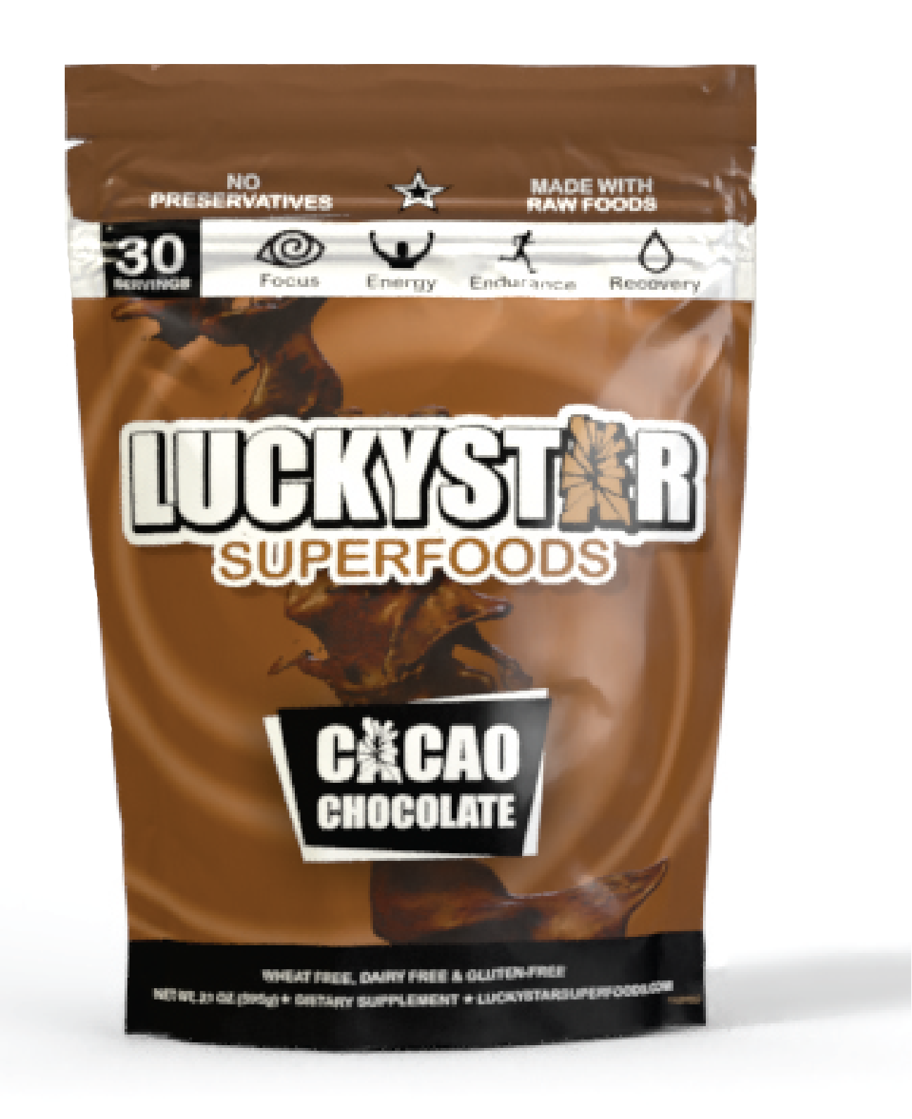
Product render. Displaying a render of finished product design helped inform the usefulness of the design in practice. We were able to quicky realize that any information at the top would be pulled off once opened. To maintain the design and information we added headroom before reaching the sample phase.
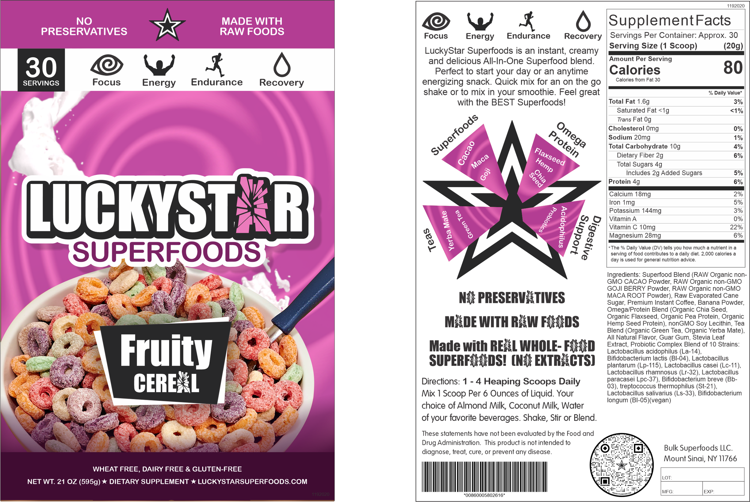
Front and back label design.